Brown
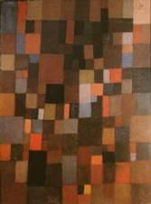
It's no coincidence that the design template chosen for this blog features brown tones. Brown in all its glorious earthtones has been on the verge of being the forgotten color. Born in the '60s and growing up in the '70s, I never anticipated the need to designate an entry on this blog for the color brown. Clothes, furniture, shag rugs, films, and sports uniforms celebrated the color and its cousin, burnt orange. Brown was beautiful, man. Chocolate Thunder! It was natural. It was the color that best matched its own tones. Brown signified a meeting ground for deep and meaningful social interaction. Then the '80s came along and brown, a color not represented on the pastel pallette, was cast aside. Even the Rolling Stones, a band that understood the beauty of brown as well as anyone, went the Miami Vice route.
Brown is making a comeback, and don't overlook it again! UPS has built its ad campaign around the confidence that the color instills. The Cleveland Browns and Cincinnati Bengals have held true, and look for the Padres to return to their old '70s uniforms before this decade's up. Recent films like We Don't Live Here Anymore capitalize on the sadness inherent in these tones.
You're still not convinced, are you? Rent The Beatles' Help! There's a scene where they're playing some songs on a hill. John, Paul, George, and Ringo are wearing varying tones of brown suits. Perfect. Brown has all the cool of black without the threatening and exclusionary aspects.
posted by frankenslade @ 10:35 AM
![]()

0 Comments:
Post a Comment
<< Home